Logo Description

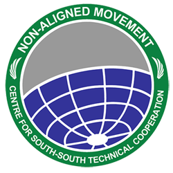
The Logo Philosophy

  1. The external circle stands for unity and engagement.
  2. The inner circle stands for the two-dimensional form of the globe according to Hellenistic astronomy.
  3. The wings of the dove represent peace. A dove emblem was also used on the badge at the first Non-Aligned Movement (NAM) Summit in Belgrade in 1961.
  4. The dividing line in the middle of the inner circle stands for the geographical location of the Member Countries of the Non-Aligned Movement (NAM), which is literally known as the South.
  5. Vertical or horizontal curve lines that divide multiple boxes stands for a network.

Logo Definition

  1. The external circle stands for unity and engagement.
  2. Two-dimensional shape of the globe is due to NAM CSSTC’s nature as an international organisation.
  3. Bird wings means that NAM CSSTC is committed to the sustainability of its position in fostering peace, stability and sustainable development.
  4. The dividing line in the middle of the globe means that NAM CSSTC represents South / developing countries’ interests and aspirations.
  5. On the lower area, the vertical and horizontal curve lines represent NAM member countries’ dynamic and cooperation networks.
  6. The number of boxes to 20 is the century of NAM CSSTC formation.

The Typeface

The Arial typeface offers a contemporary look that differentiates it from the typeface on a typewriter (serif). The features of Arial are humanistic and unique, but compatible with the late 20th century atmosphere. In addition, Arial’s flexible characteristics make it very popular for magazines, ads, and promotions.
Colour Settings and Context

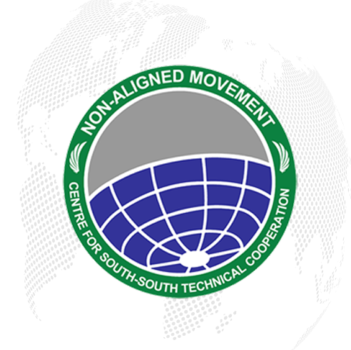
The green symbolises NAM CSSTC’s noble aspirations on success and joint progress.

Cyan: 87; Magenta: 24; Yellow: 100; K: 13

The grey colour of the northern part of the globe reflects a sign of Northern countries’ active involvement, without creating dependence.

Cyan: 31; Magenta: 25; Yellow: 25; K: 0

White is the purest colour. White is a representation of pureness, honesty, and quality, and a fresh start.

Cyan: 0; Magenta: 0; Yellow: 0; K: 0

The blue colour symbolises NAM member countries’ rapid growth and prosperity.

Cyan: 96; Magenta: 96; Yellow: 0; K: 0

The combination of these colours symbolises the unity and cooperation among NAM member countries.